Most people pick five photos they like, paste the exact same set onto every app, and then quietly wonder why one profile pulls matches while another sits dead. The uncomfortable answer is that the best photos for Tinder, Bumble, and Hinge are not the same photos: not in content, not in order, and not in tone. Each app runs a different algorithm, attracts a different mindset, and asks its users to make decisions in a completely different way. A picture that wins a three-second Tinder swipe can read as try-hard on Hinge, where someone is slowly reading your prompts and deciding whether you are worth a comment.
This guide goes deep on all three. We will break down each app's culture, demographics, and ranking mechanics, then translate that into the exact photo strategy and photo order that wins on each one. We will cover the specific mistakes that quietly tank profiles, address common objections, and show how AI photo tools fit in when your camera roll cannot cover every shot. By the end you will audit your set per app instead of guessing.
Why the best photos for Tinder, Bumble, and Hinge are not the same set
Start with the mechanics, because they drive everything else.
Tinder is a volume-and-speed machine. Users swipe fast, often through dozens of profiles in a sitting, and the lead photo carries almost all of the early weight. Tinder's bio is short and frequently empty, so the photos do nearly all the talking. Tinder also runs a feature called Smart Photos, which quietly A/B tests your images: it shows different photos as your lead to different people, tracks which one earns the most right swipes, and reorders to put the winner first. That tells you something important. On Tinder, a single thumbnail can make or break you, and the app itself is optimizing for instant visual appeal.
Bumble is built around one rule: in heterosexual matches, the woman messages first. She also has a limited window to do it before the match expires. That single design choice reshapes the entire photo game. You are no longer just trying to be swiped right; you are trying to give someone a reason to type the first message and feel comfortable doing it. Bumble's algorithm also leans on profile completeness, verification, and engagement quality rather than raw swipe volume, which rewards a fuller, more intentional profile.
Hinge is the relationship app, and it is structured to behave like one. Its slogan, "designed to be deleted," is not just marketing; the format enforces it. Hinge requires six photos and pairs them with written prompts, and people can like (and comment on) a specific photo or prompt rather than the whole profile. Hinge has publicly described using a version of the Nobel-winning Gale-Shapley stable-matching approach, meaning it tries to predict mutual compatibility, not just one-directional attraction. The practical upshot: your photos are not only judged, they are mined for something to talk about.
So the right question is never "is this a good photo?" It is "is this the right photo, in the right slot, for how this app's users actually decide?" Three apps, three different pitches of the same person.
The best photos for Tinder, Bumble, and Hinge at a glance
Before the deep dives, here is the high-level comparison. Use it as a cheat sheet, then read the sections below for the why behind each cell.
| Tinder | Bumble | Hinge | |
|---|---|---|---|
| Core culture | Fast swiping, photo-first, broad intent | Women message first, more intentional | Prompts plus relationship intent |
| Typical mindset | "Anyone interesting nearby right now?" | "Who would I actually want to talk to?" | "Who could this become something with?" |
| What the algorithm rewards | An eye-catching lead photo and active usage | Profile completeness and quality engagement | Full profiles and likes that include comments |
| Photo limit | Up to 9 (5–6 strong ones is plenty) | Up to 6 | 6 required to use core features |
| Lead photo job | Stop the scroll in one second | Feel warm and message-able | Be the easiest thing to comment on |
| Winning shot types | Sharp solo, full body, lifestyle hook | Warm headshot, activity, light social proof | Face, full body, activity, social, travel, personality |
| Biggest mistake | Group photo or dark shot as the lead | Stiff, context-free, or "thirsty" lead | Recycling Tinder-style club photos |
Notice the pattern: the content overlaps, but the emphasis and ordering shift with each app's audience. That shift is where most profiles go wrong.
Tinder: win the three-second swipe
Tinder is the fastest, most visual, and most forgiving of the three to set up, and the least forgiving if your lead photo is weak. Because the bio barely matters and the swipe is instant, your first image is doing roughly all of the heavy lifting. People are not reading; they are reacting.
Who you are talking to. Tinder has the largest and youngest-skewing user base of the three, with a reputation for casual dating but plenty of people seeking relationships too. The intent is broad, so your photos need to communicate "fun, attractive, and easy to be around" fast, without over-explaining.
What wins on Tinder:
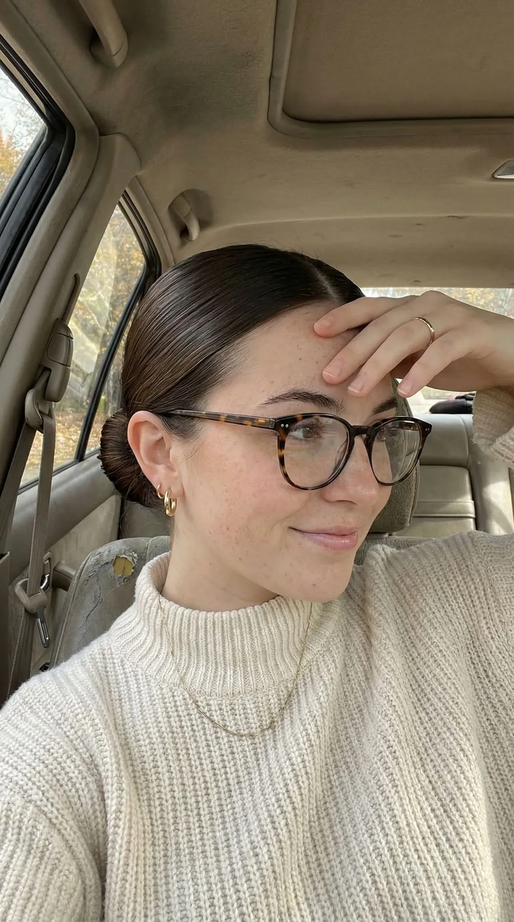
- A bright, sharp, eye-level lead headshot with a genuine smile and visible eye contact. Forward-facing, well-lit, uncluttered background. This is the photo Smart Photos will reward if it performs, so make it your strongest single image.
- High visual contrast so your thumbnail pops in a fast-scrolling feed. A clean or simple background beats a busy one because the eye lands on your face instantly.
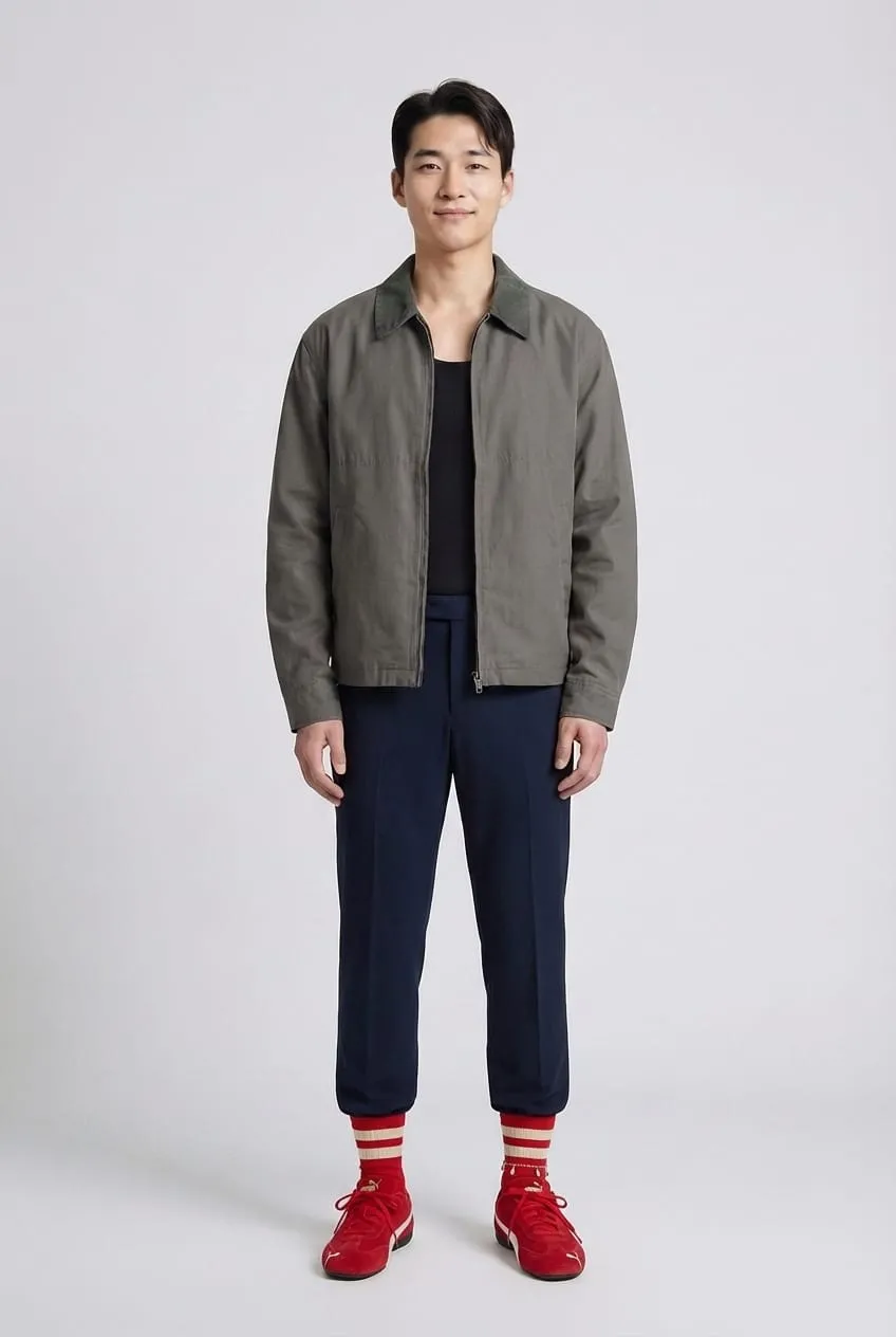
- One unambiguous full-body shot so nobody has to guess your build. Leaving it out reads as hiding something.
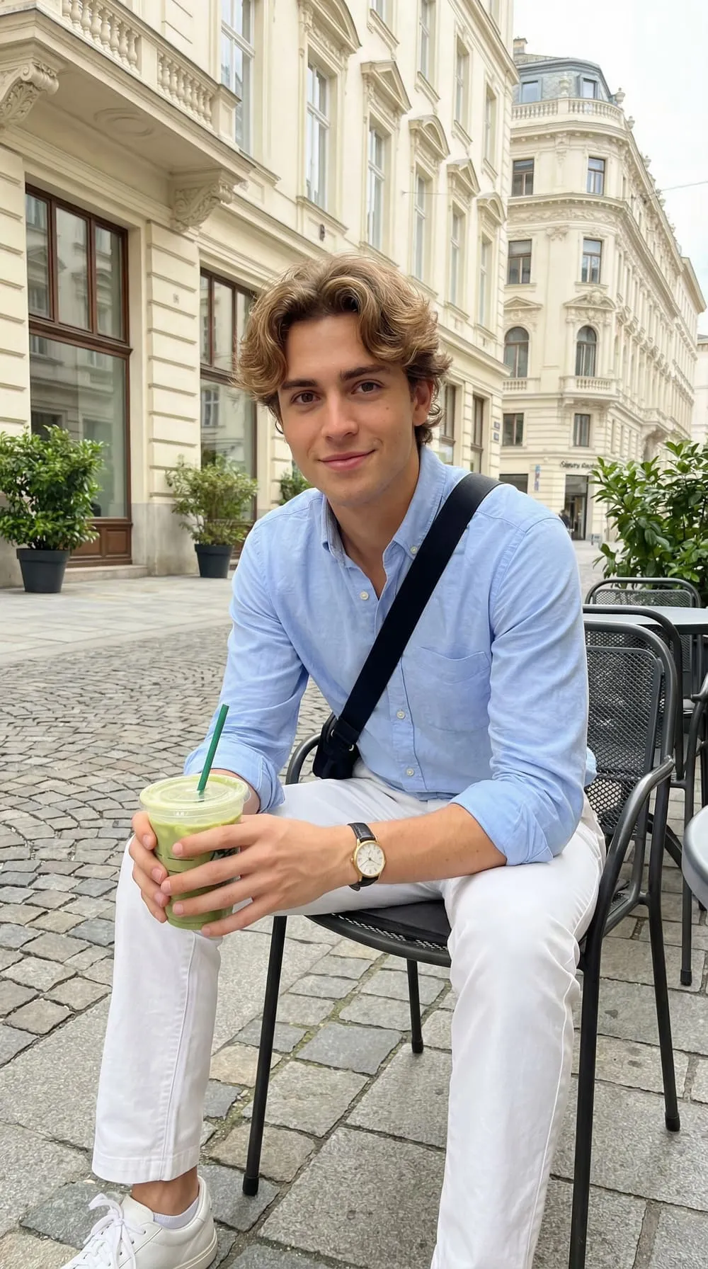
- One or two lifestyle photos that hint at a life: traveling, a clear hobby, out somewhere interesting. These add texture without slowing the swipe.
Photo order for Tinder: lead headshot, full body, lifestyle/hobby, light social or candid, then an optional second strong portrait. Tinder allows up to nine slots, but quality crushes quantity. You are judged by your weakest photo, so a mediocre eighth image actively drags down a strong set. The pattern we see most: five or six excellent photos beats nine uneven ones.
A concrete example. Imagine two leads. Photo A: a slightly dim group shot at a bar, you in sunglasses, three friends around you. Photo B: a daylight shot, clean background, relaxed smile, you clearly the only subject. On Tinder, B wins almost every time. In A, the viewer has to work to find you, and a one-second swipe never rewards work.
Men and women tend to optimize different signals here. If you want a structured, gender-specific starting set, see our breakdowns of the best Tinder photos for men and Tinder profile photos for women, which walk through exactly which shot to lead with and why.
Bumble: lead with warmth, because she messages first
Bumble's women-message-first rule is the single most misunderstood thing in dating-app photography. It does not just change who sends the first text; it changes what your entire photo set needs to accomplish. On Tinder you are optimizing to be swiped right. On Bumble you are optimizing to be messaged, and there is a clock attached: the match expires if no one acts in time.
In our experience, approachability matters at least as much as raw attractiveness. A photo can be objectively striking and still fail on Bumble if it gives no opening, no warmth, and no obvious reason to start talking. You want someone to look at your profile and think, "I could say something to him," not just "he's good-looking."
Who you are talking to. Bumble skews slightly more intentional and relationship-leaning than Tinder, and its design is deliberately more comfortable for women. Profiles get read more carefully, and completeness counts, so a half-finished profile with two photos signals low effort and gets buried.
What wins on Bumble:
- A warm, well-lit lead headshot with a real smile that reaches the eyes: open body language, not a brooding smolder. The vibe should say "easy to talk to."
- Obvious conversation hooks. A photo doing an activity, holding a (single) dog, standing somewhere distinctive, or caught mid-laugh hands the other person an opening line. You are pre-loading the first message for her.
- Light, tasteful social proof: one photo that shows you have friends and a life, without making your lead a crowded group scene where you blend in.
- Honesty and recency. Because Bumble's audience reads carefully and is more relationship-minded, photos that obviously look like the current you build trust fast and prevent the deflating "is this even him?" moment.
Photo order for Bumble: warm headshot, then a conversation-hook activity shot early (slot two or three is prime real estate because it is where curiosity converts to a message), a full body, then light social and a candid. The early hook matters more here than on Tinder because the goal is conversation, not just a right swipe.
A concrete example. A mirror gym selfie might earn swipes on Tinder. As a Bumble lead, it often backfires: it reads as "thirsty," gives no conversational opening, and skips the warmth that makes someone comfortable starting. Swap it for a daylight photo of you laughing on a hike with your dog, and you have just written the first message for her: "okay, what's the dog's name?" The Bumble profile photo guide digs deeper into striking that warm-but-confident balance.
Hinge: earn the comment, signal intent
Hinge is the most structurally different of the three, and copying your Tinder set straight over is the classic blunder. On Hinge, people do not just swipe; they like a specific photo or prompt, frequently attaching a comment. Your photos are being read for conversation material, and the algorithm rewards profiles that generate quality engagement, not just attraction.
Who you are talking to. Hinge's audience skews clearly toward people who want a relationship; the "designed to be deleted" positioning self-selects for intent. They are willing to read prompts and look at all six photos, so a one-dimensional, purely thirst-driven set feels off-brand and gets passed over.
Why six photos changes the strategy. Tinder lets one killer lead carry you. Hinge requires six and distributes attention across all of them, so a strong Hinge set is balanced: every slot should add a new facet rather than repeat the same angle. A complete, varied profile also reads to the algorithm as a quality signal.
A strong six-photo Hinge set usually covers:
- A clear, friendly face shot as the lead: smiling, forward-facing, genuine.
- A full-body photo so build is honest and obvious.
- An activity or hobby shot, the comment magnet. Photos that show you actually doing something tend to pull far more engagement than static portraits.
- A social moment with friends that signals you are likeable and have a community.
- A travel or "place with a story" photo that invites a question.
- A personality or candid shot that captures your actual vibe.
Pair photos with prompts deliberately. Hinge's superpower is that a photo and a prompt can work as a unit. If your prompt is "the way to win me over is…" and you answer with something about good tacos, an activity photo of you at a taco stand turns a clever line into a believable one, and gives someone two things to comment on at once. We've found that candid, in-the-moment shots generally outperform stiff posed ones here, because authenticity is the whole point.
A concrete example. A shirtless club photo as your Hinge lead does double damage: it reads as misaligned with what Hinge users are looking for, and it gives no comment hook. Replace it with a candid of you at a pottery class, mid-laugh, hands covered in clay, and you have a photo that signals personality, invites "wait, you do pottery?", and matches the app's intent. Our Hinge photo strategy guide covers prompt-and-photo pairings that reliably pull comments.
Photo-order strategy: sequencing the same shots differently
Most advice stops at "have good photos." The overlooked lever is sequence: the same library of images, reordered, performs differently on each app.
- Tinder front-loads. Put your single strongest, most scroll-stopping image first and let it do the work; the back half of your slots is nearly invisible to fast swipers, so trim filler rather than pad to nine.
- Bumble front-loads the hook. Lead with warmth, but get a conversation-starting photo into slot two or three, because the entire goal is to convert a look into a first message before the match window closes.
- Hinge spreads the load. No single slot dominates, so balance the set across face, body, activity, social, travel, and personality. A weak fourth or fifth photo hurts more here than on Tinder because all six get seen.
Common mistakes that sink profiles on every app
Some errors cost matches no matter which app you are on. Each comes with the objection people use to justify it, and why the objection does not hold.
- The mystery lead photo. Sunglasses, a hat, a distant shot, or a group photo first means people cannot tell who you are. "But it's my coolest photo." Cool is worthless if the viewer cannot identify you in one second. Lead with a clear, well-lit face.
- One-note variety. Five near-identical selfies from the same day, same angle, same shirt say nothing new. "They're all flattering." Maybe, but a set with no range looks hastily assembled and reads as having little life outside your phone. Vary lighting, setting, outfit, and distance.
- Outdated or misleading photos. Pictures from five years or twenty pounds ago build distrust before you ever meet. "I look basically the same." If a first date would feel a gap between the profile and the person, the photos over-promised, and that gap erodes trust before the conversation starts.
- Padding to hit a number. Because you are judged by your weakest image, a mediocre sixth or ninth shot can drag down a strong set. "More photos means more chances." The opposite is true; cut anything that is not pulling its weight.
- Wrong-app energy. Shirtless club pics belong nowhere near a relationship-focused Hinge profile, and a brooding solo smolder undercuts Bumble's warmth requirement. Match the photo to the audience, not to your personal favorites.
- All-professional, zero-candid. "I paid for a photographer, so I'll use only those." A set that is 100% studio can read as staged, especially on Hinge. Blend intentional photos with genuine candids.
The throughline: every photo should earn its slot by adding new, honest information. If it does not, it is costing you.
How AI photos help you build the best photos for Tinder, Bumble, and Hinge
Here is the practical bottleneck. Almost nobody has a clean, varied library that covers a sharp eye-level headshot, an honest full-body shot, an activity photo, a travel scene, and a candid personality shot, let alone versions tuned for three different apps. Most camera rolls are group shots and the same three poses. Hiring a photographer solves it but costs time and money, and a single shoot still tends to produce one location and one outfit.
This is the gap AI photo generators fill. A tool like TryOnWise builds a personal model from a handful of your real selfies, then generates realistic photos of you in new outfits, settings, and lighting. That lets you assemble a per-app set deliberately: a bright eye-level lead for Tinder, a warm and approachable headshot for Bumble, and an activity-or-travel shot that earns a comment on Hinge, all without waiting for the perfect trip or a free weekend.
The rule that keeps this honest is simple: the photos must look like you on a genuinely good day, not like a different person. Keep your real face, build, and age, blend AI-generated shots with your best authentic candids, and discard anything that makes you pause and think "that's not quite me." Used that way, AI is less about faking a life and more about finally having the right photo for the right app's audience. When you are ready to build your set, you can generate your AI dating photos and tailor a profile for each platform from just a few selfies.
Frequently Asked Questions
Should you use the same photos on Tinder, Bumble, and Hinge?
Not exactly. You can reuse your strongest shots across all three, but the lead photo and the ordering should shift. Tinder rewards a sharp, scroll-stopping lead; Bumble rewards a warm, approachable headshot plus an early conversation hook because women message first; Hinge rewards a balanced six-photo set where shots are easy to comment on. Reorder and re-emphasize per app rather than copying your set wholesale.
What should your first photo be on a dating app?
A clear, well-lit, forward-facing shot of your face with a genuine, relaxed expression, ideally smiling, with real eye contact, taken within the last year or two. The lead does most of the work in earning matches, so keep sunglasses, hats, heavy filters, distant framing, and group shots out of that slot. The single image that most looks like you on a great day belongs first.
How many photos should you have on Tinder, Bumble, and Hinge?
Tinder allows up to nine and Bumble up to six, but four to six strong photos is the sweet spot for both. You are judged by your weakest image, so padding hurts. Hinge is different: it requires six photos or videos to use its core features, so you genuinely need a full, varied set there. Aim for quality and range over hitting a maximum.
Are candid or posed photos better for dating apps?
A mix wins, but candid, in-the-moment shots tend to outperform stiff posed ones, especially on Bumble and Hinge where approachability and personality carry weight. Natural light, real expressions, and genuine activity read as trustworthy and hand people something to comment on. Pair one clean, intentional lead photo with candids that show your actual life rather than going all-studio or all-snapshot.
What photos should you avoid on dating apps?
Skip group shots as your lead, sunglasses or hats hiding your face, dim or distant images, mirror gym selfies as the opener, heavy filters, and anything five-plus years out of date. On Hinge specifically, avoid recycling Tinder-style club or shirtless photos; they clash with the relationship intent of the audience. Every photo should add new, honest information; cut the ones that do not.
Can you use AI-generated photos on Tinder, Bumble, and Hinge?
Yes, as long as they still clearly look like you. These apps do not ban AI enhancement outright; they ban misrepresenting your identity, age, or appearance. An AI portrait trained on your own face, with better lighting or a restyled outfit you would actually wear, fits the rules; a photo showing a different face or body does not. Keep your real features, blend AI shots with genuine ones, and always check each app's current terms.
Do smiling photos really get more matches?
Generally, yes. A warm, genuine smile signals approachability, which is exactly what a lead photo needs to do across all three apps, and it matters most on Bumble and Hinge, where comfort and conversation drive the first move. Smiling, forward-facing headshots are widely reported to outperform serious or sunglasses-covered shots as the opener. Save the moody, no-smile portraits for a later slot if you use them at all.
The bottom line
The best photos for Tinder, Bumble, and Hinge come down to matching the photo, and the photo order, to how each app's users actually decide. Tinder wants a billboard that stops the scroll. Bumble wants a warm handshake that earns the first message. Hinge wants a six-beat short story worth commenting on. Same person, three deliberately different pitches.
Audit your current set against each app's culture: fix the mystery lead photo, get a conversation hook in early for Bumble, balance all six slots for Hinge, and cut any filler that drags you down. If your camera roll cannot cover every shot each platform rewards, AI photo tools can help you build the right set from a few real selfies, honestly and without an expensive shoot. Dial in the right photos for the right app, and the matches follow.